A title for this piece has not yet arrived, but might turn into one in my tree series. The tree itself is one that I can see from my work space, it’s a gigantic alder growing at the edge of what was a large pond many years ago. I stopped myself going further – I have a tendency to stuff an image with too many details, now you can, if necessary, complete the image yourself.
Icon I has now been moved from a work in process to a finished drawing. It is a progression from ideas I had way back with images of trees depicted as entities to be revered, in these times it seems more appropriate than ever. At the time I tried using coloured pencils to create a luminous background but was not happy with the result. Since then I have used gold printmaking colour for my linocuts and had the idea to go back to my thoughts on trees as icons. So in Icon I (which started as a monoprint) the shape of the trees were worked out using the printmaking colour.
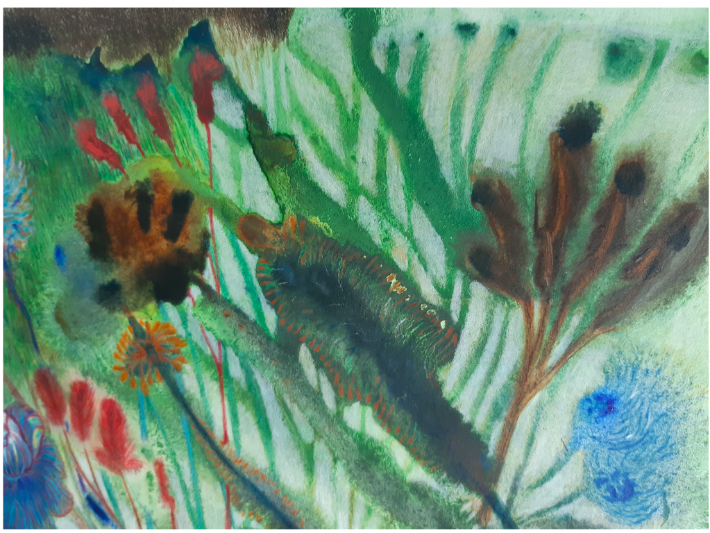
An abundance of plants, a snapshot with a dark border. Yet again, a monoprint, this time with water colour and then, again, coloured pencils. You might have a look at Garden, an earlier post, a bit of a series developing. And both left-leaning for some reason. It is said that the eye is more sensitive to movements coming in from the left so these two are clearly not taking advantage of this ‘flow’. Just realised that as these are monotypes where I first paint on an acrylic sheet, using my right hand, before turning upside down and pressing the painted sheet down on paper. Perhaps it is more natural for the hand/arm to move from bottom left to top right thus creating a curved movement in the work? Hmm ……
I seem to not being able to change the organic, ‘dotty, and ‘flowing’ way of drawing. And yes, red is also a prevalent feature. With Flow I just had to stop – don’t think another spot of colour would improve the final work! Next piece – maybe all in grey …..