Buds II

Uncategorized

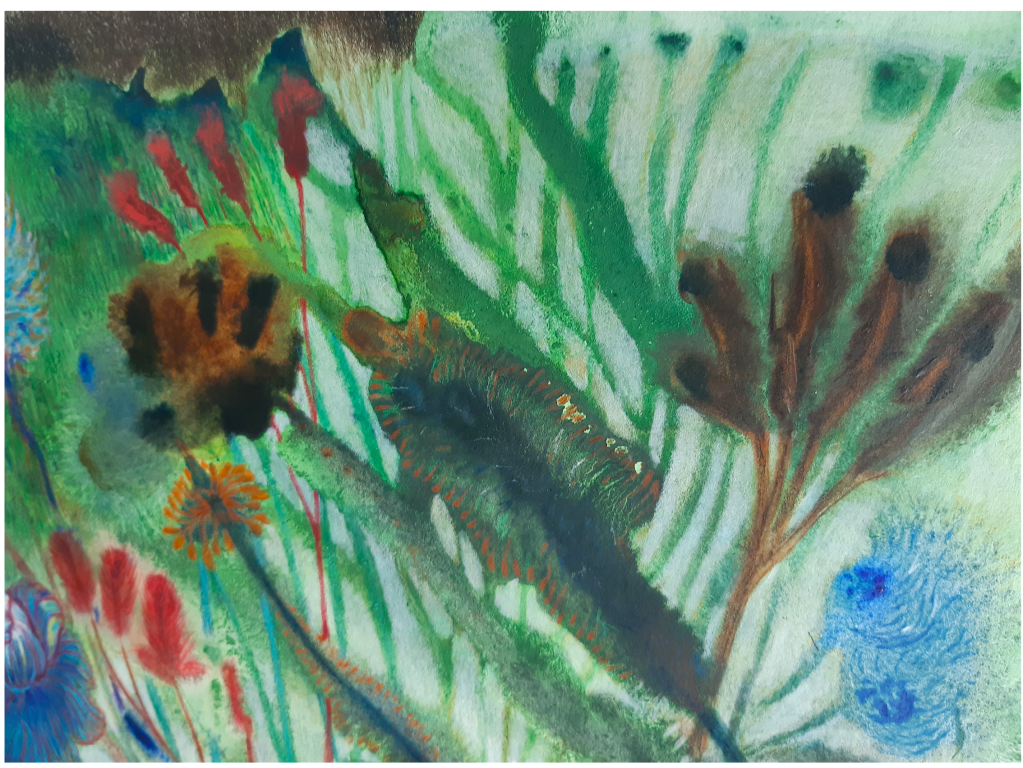
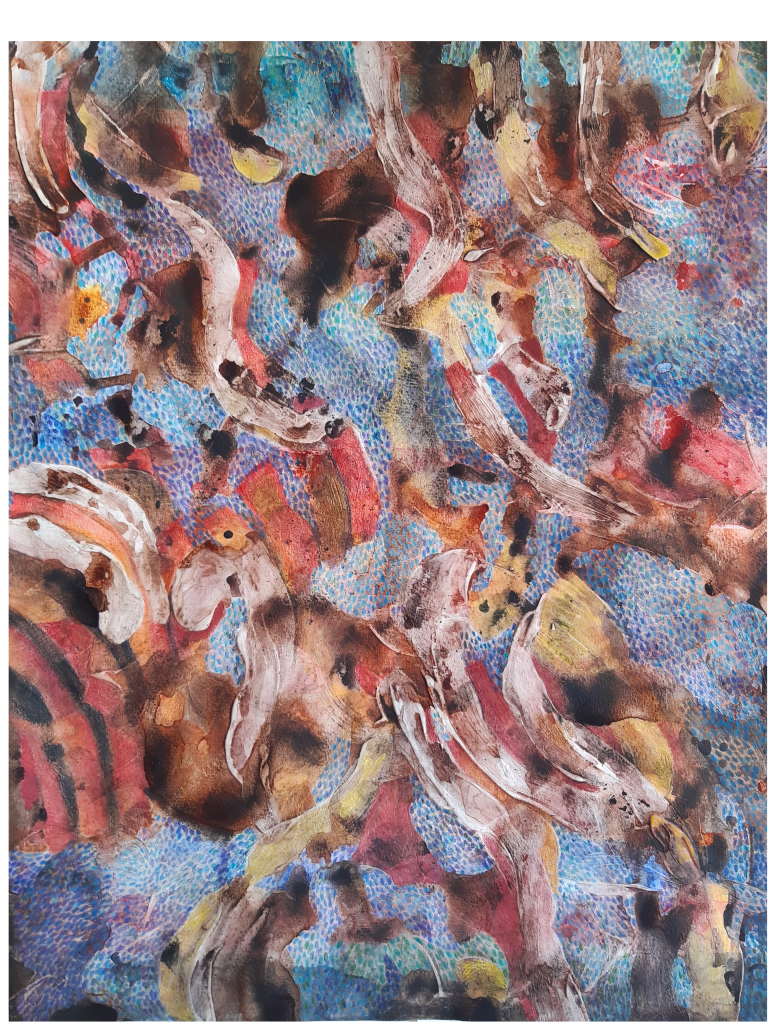
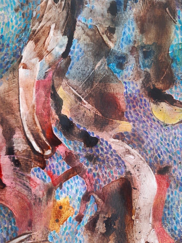
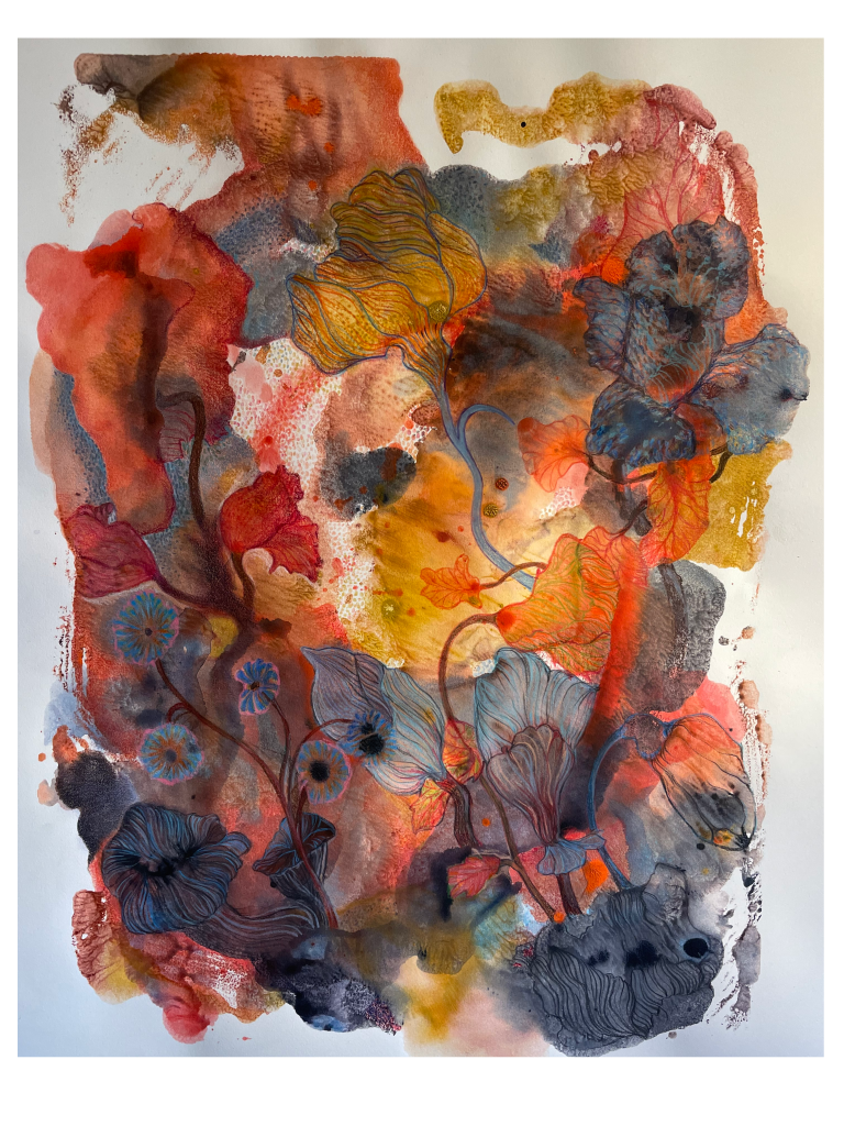
Number 2 of what could be a series – six of which I feel are almost there. I’m hanging them on the walls in my studio, waiting for them to ‘speak’ – more colour? tone down or highlight an area? add more ‘features’? Sometimes it takes weeks before a piece is silent and lets me put it on the shelf. I did the ‘base’ last summer in a flurry – I could almost call it inspiration – but it was more of finding the right colours to use. Kept looking at them but nothing moved me to start drawing. Did try though but had to erase my efforts. Colour is what I start with and with the monoprint I’m leaving it up to the unpredictability of the print to create a structure. I can now use a quote from Braque “Let us forget things and consider only the relationships between them” – in this case colours instead of “things”.

Monoprint I 2022

Uncategorized

A title for this piece has not yet arrived, but might turn into one in my tree series. The tree itself is one that I can see from my work space, it’s a gigantic alder growing at the edge of what was a large pond many years ago. I stopped myself going further – I have a tendency to stuff an image with too many details, now you can, if necessary, complete the image yourself.

Icon I

Uncategorized

Icon I has now been moved from a work in process to a finished drawing. It is a progression from ideas I had way back with images of trees depicted as entities to be revered, in these times it seems more appropriate than ever. At the time I tried using coloured pencils to create a luminous background but was not happy with the result. Since then I have used gold printmaking colour for my linocuts and had the idea to go back to my thoughts on trees as icons. So in Icon I (which started as a monoprint) the shape of the trees were worked out using the printmaking colour.

Red Tails

Plants, Uncategorized

An abundance of plants, a snapshot with a dark border. Yet again, a monoprint, this time with water colour and then, again, coloured pencils. You might have a look at Garden, an earlier post, a bit of a series developing. And both left-leaning for some reason. It is said that the eye is more sensitive to movements coming in from the left so these two are clearly not taking advantage of this ‘flow’. Just realised that as these are monotypes where I first paint on an acrylic sheet, using my right hand, before turning upside down and pressing the painted sheet down on paper. Perhaps it is more natural for the hand/arm to move from bottom left to top right thus creating a curved movement in the work? Hmm ……

Flow II

Uncategorized

Although this has been numbered as no two in the Flow series it has a number of predecessors. (Note to self, get a grip on documentation.) I experimented with painting gesso on 300 gram watercolour paper and continued with watercolour and coloured pencils. It has been a fight to reconcile the raised brush strokes of the gesso with the layers of watercolour but I decided yesterday that the struggle must stop here. The result is ambiguous, is it something growing, flowing or just a snapshot of light in a (colourful) glade? Or the remains of a structure?

Unless I suddenly see another possibility of portrayal I am now releasing it from my control.